

 Bahasa Indonesia
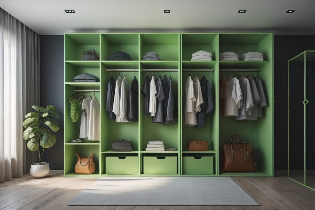
In bedroom interior design, the wardrobe often becomes the element with the largest visual surface. Due to its dominant presence, choosing a wardrobe color cannot be done randomly. The right color can strengthen the overall concept of the space, while a poor choice may disrupt the visual balance of the bedroom.
Below are several design approaches that can serve as guidelines when selecting wardrobe colors.
1. Decide Whether the Wardrobe Should Blend In or Stand Out
An important first step is defining the role of the wardrobe within the room design. In bedrooms that already feature a strong focal point—such as an artistic headboard or an accent wall—the wardrobe should visually recede by using calm, understated colors.
On the other hand, in minimalist and clean spaces, the wardrobe can function as a visual highlight through the use of distinctive colors or materials.
2. Consider How Color Responds to Natural Light
Color never exists independently of light. The intensity and direction of natural lighting greatly influence the final appearance of a wardrobe.
In bedrooms with limited light or cooler tones, wardrobe colors with warm undertones can help balance the atmosphere. Meanwhile, well-lit spaces allow for broader color exploration, including cooler and neutral palettes.
3. Use Color Schemes to Control Perceived Room Scale
In smaller bedrooms, wardrobe color plays a key role in creating visual spaciousness. Light and soft palettes—such as warm whites, creams, or light wood tones—help reflect light and make the room feel more open.
A tone-on-tone approach between the wardrobe and the walls is also commonly used to reduce the “heaviness” of large furniture volumes.
4. Apply Contrast as an Accent, Not a Dominant Feature
Contrasting colors on wardrobes can enhance visual appeal when applied thoughtfully. Instead of using one bold color throughout, contrast can be introduced through selected panels, two-tone combinations, or variations in finishes.
This approach allows the wardrobe to remain visually interesting without overpowering the overall harmony of the space.
5. Align with the Design Language of Other Furniture
Wardrobe color should not stand alone but rather communicate with other elements in the bedroom. Harmony with the bed frame, bedside tables, and mirror frames helps create a more cohesive and curated interior.
In this context, the wardrobe acts as a visual anchor that ties all design elements together.
6. Consider the Emotional Impact of Color
As a resting space, the bedroom requires a calming atmosphere. Wardrobe colors that are too dark or overly bold may create a heavy impression and reduce visual comfort.
A safer design approach is choosing colors with low saturation but sufficient depth, allowing the space to feel serene while still maintaining character.
7. Use Color to Express Room Identity
In bedrooms dominated by neutral palettes, the wardrobe can become a medium for expressing visual identity. Colors such as muted green, dusty blue, or soft maroon can add strong character without appearing excessive.
This strategy is often used to create bedrooms that feel personal yet remain elegant.
8. Explore Wood Materials in a More Dynamic Way
Rather than relying on a single wood tone, designers can explore combinations of different wood shades, grains, and textures. Variations in natural wood tones add visual richness and depth.
This approach also makes it easier to coordinate wardrobes with other furniture while preserving a timeless natural aesthetic.
Closing
Choosing wardrobe colors is part of a broader design strategy, not merely an aesthetic decision. By considering visual roles, lighting conditions, spatial scale, and material character, wardrobes can become elements that strengthen the overall bedroom concept—both functionally and visually.
